OPEN WATER – ZINE
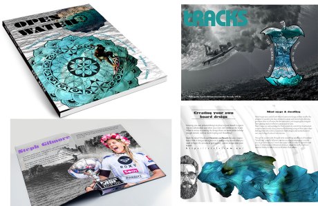
My zine “OPEN WATER’ was based both on the briefs provided and my personal interest, Surfing, with these aspects in mind I formed this miniature magazine over the weeks 5-8 during the course. This project involved research, making layouts, and editing photographs through the use of Photoshop and In design. The contents of the zine includes examples of adds, DIY help, and information on Australian surfing pro Stephanie Gilmore and board shaper Daren Handley (DHD surf boards). The add employs the use of a metaphor of an apple, in this case using “Gnarly to the core” to further relate it to the context it is used in.
—
OPEN WATER – LOGO DESIGN
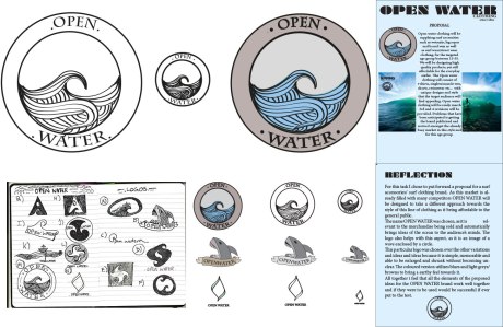
“Open water” is a brand I created following the outlines of the brief provided. Open water is a clothing brand aimed at the youth of Australia in particular those involved/ interested in surf culture. The process I went through in order to achieve the finished product of the logo included creating thumbnails, picking out the most relevant ones, making them on illustrator then Appling variation (colour, size) and choosing the most successful of the three. The chosen logo design is simple, yet interesting, works well when colour is applied and is still noticeable and visible when made smaller if needed.
—
GOOGLE DOODLE
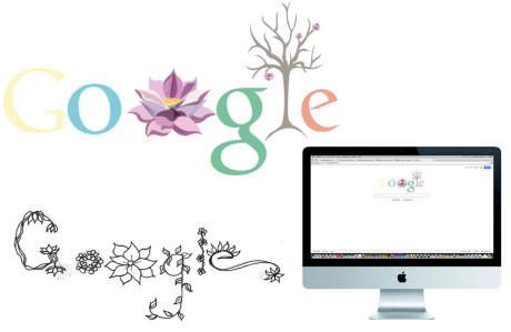
In this brief I was asked to create a Google doodle based on an Australian theme. The Google doodle I created was to aid the celebration of Floriade. Once every year Canberra throws a festival “Floriade” to celebrate spring and the magnificent flowers that it brings, it runs for a course of 30 days over September and October. To embrace the spirit of spring I utilised colours of the season, fresh green, pinks, blue, yellows and oranges, I also changed the l in “Google” to a tree and with the use of animating, got it to appear as it the tree was blooming with little pink flowers.
—
LOTUS GREETING CARD
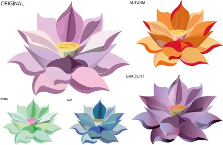
This brief asked us to create a image for a greeting card in illustrator that we could change the colours of to suit a theme and achieve a certain “feel”. I chose to create a design of a lotus flower, using overlaying colours and opacity to convey a sense of depth and three dimension. The original was made with the generic pinks that lotus flowers are with a yellow centre, I then change the colour pallet four times to create the different feels of autumn, winter, spring, and sad. The last variation included the use of gradients to further the sense of depth to the flower.
—
THE GREAT WAVE
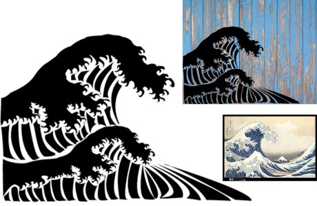
Out of all the stencils we made this was by far my favourite in terms of style and legibility, all the bridges are successful and would be able to work if used in a real life situation. I chose to do the traditional Japanese great wave because we were told to choose something that says something about ourselves, I think the great wave works well as it represents both my love for the ocean, different cultures and travelling. After I made the stencil I placed it in situ to get a feel for how it would look if it were to be used in real life.
—
LOTUS WALL PAPER
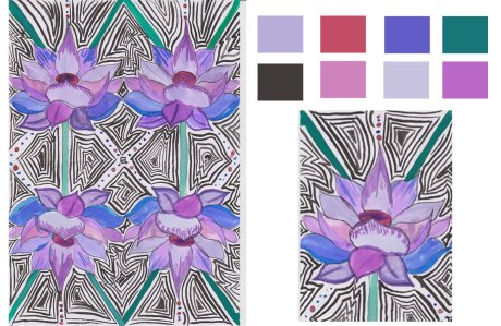
To successfully create this wall paper as it was stated in the brief we had to choose something that inspired us from nature draw it up so when it was repeated the design would link together and have a continuous effect. I chose the lotus flower to base my design around as it is a beautiful flower that I thought would work well with the brief. When I finished drawing it up I painted it and filled in the spaces to give it more effect.
—
PHOTOSHOP MONTAGE
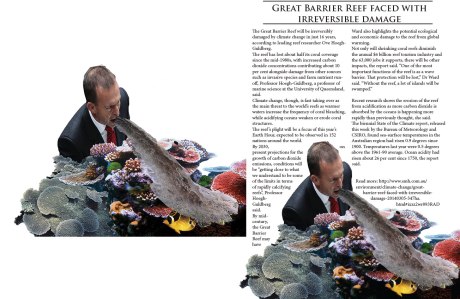
This Photoshop montage was made based on a recent environmental tragedy that I feel very passionately about, which is the passing of laws to dump dredge waste into the Great Barrier Reef. The design depicts the beautiful habitat, what’s going to happen to it and who is behind it, creating a social and environmental statement. This is shown throw an imagery of Tony abbot throwing dredge waste up onto the reef.
—
NEWTOWN STREET ART
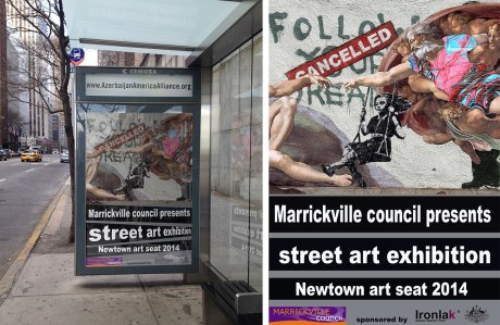
This brief required us to make a poster to advertise a street art exhibition for a gallery in Newtown. To achieve this I combined both street art and traditional art together to show that street art is now also considered “gallery worthy”. On the poster I also included the sponsors and who the exhibition was being presented by. When this stage of the process was finished I then placed it in situ at a bus stop and included the reflections that would be there in real life so it would look more realistic.
—

0 Comments